
Fun Fact: There are almost 2 billion websites in the world today.
With so many websites, it can be hard – seemingly impossible – to stand out.
Getting traffic to your site is hard enough on its own, and getting those people to stay and actually do something is harder still.
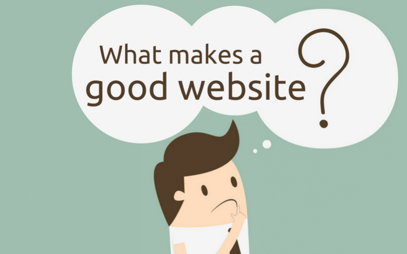
In short, a good website should excel in both form and function. It should have a clear purpose. It should be visually pleasing and easy to navigate. It should perform well for a wide range of visitors and be technically stable and secure. Good websites are attractive, functional, and useful.
Your website is sometimes the only thing your customers see. You want that sucker to be so eye-poppingly awesome that it attracts backlinks, case studies like these, media attention, and customers out the wazoo.
And you’re in luck. Because in this post, I’m going to teach you everything we know about what makes a great website.
And you don’t even need to be a designer. Yippee!
The Index of Awesome Web Design (Click to Navigate)
Section 1: Visual Website Design (AKA “Prettiness”)
Section 2: Technical Website Design (AKA “Geeky Stuff”)
Section 3: Website Tools (AKA “Useful Stuff to Make Your Website Better”)
Enough talk, let’s dive into web design 101.
Alright, so this is a pretty huge subject to tackle. There are thousands of books and courses written on web design.
Before I start spatting off lessons, I want to ensure you can take something away and implement it today.
So, here are the four basic principles of what makes a good website to keep in mind before your redesign/launch:
Now that you have the major principles in mind, let’s dive a little deeper.
Imagine a scenario for a moment.
You’re looking for a gift for your sister’s birthday. You notice a tweet by someone you follow sharing their friend’s new clothing shop. You click.
Then you see this.
 Haha, nope. You’re gone.
Is this an extreme example? Yes.
Does website design still matter a whole heck of a lot? Yup.
Am I going to tell you what you should do to make your site look great? You betcha.
You see, visuals affect everything from conversion rate to time on page, trustworthiness, and organic backlinks (which help you rank your site on Google.)
So the equation looks like this:
Great site design = More trust = Better conversions
Great site design = More trust = More conversions. Click To Tweet
How do you make your site look great? Start with your brand.
Your brand is your image. Everything from the colors you use to the fonts you choose affects people’s perception of who you are.
In her guide to branding, Sonia Gregory says that “as a small business, you may be competing against big brands with devoted customers. That’s why you have to find ways to differentiate–with a solid brand building process of your own.”
What do you want people to think when they see your site?
Edgy, modern, satirical, professional, something else?
You can convey those things through your design. Just take a look at the psychology of color – different colors convey different emotions.
In fact, a study titled “Impact of color on marketing” found that up to 90% of snap judgments made about products can be based on color alone, depending on the product.
Beyond color, you also have font choice. And yes, there is a psychology behind font choice as well. Ted Hunt from Crazy Egg made this cool infographic about it:
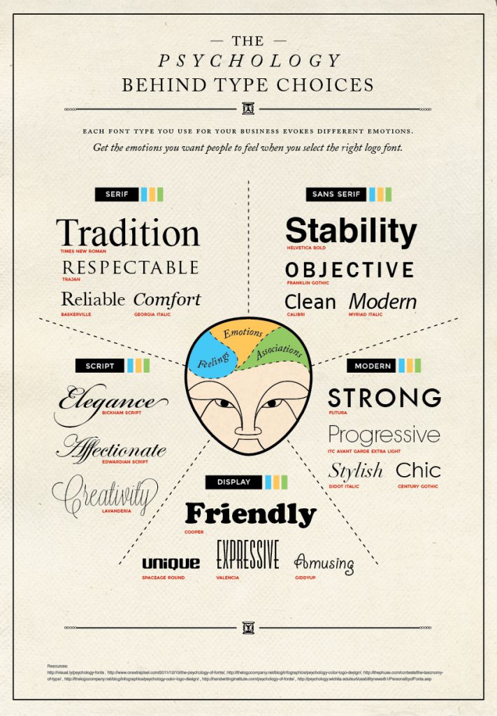
Regardless of the font you choose for your logo and branding efforts, you should always choose readability over emotional feel for your main body font. Typically that means sans serif fonts, as they read the best on the web.
One last tip on font choice: Don’t use more than two fonts in your design. Pick two that compliment each other and stick with those for your entire brand.
Key Takeaway: Choose no more than three colors and two fonts to represent your brand. Write down the fonts and color codes and use them consistently across your entire site and marketing efforts.
Imagery is a major part of website design. And yet so many people do it wrong.
Great images add value to the visitor. They help explain a key point and give the eyes a break. They even help sell your products and services.
For example, if you’re an eCommerce site, you want your product photos to be high-quality and show tons of different angles.
Which of these flowers would you rather buy?

(Source)
If you even saw the image on the right, you’d probably leave and never come back. The middle image is better, but still not great. The one on the left makes you trust the website.
Just be careful, because bad images actually reduce readership.
Remember design principle #1: Great design has a purpose in mind.
Any image that doesn’t have a purpose is a bad image. Period.
If you needed more incentive, page load speed (which I discuss in section two), is extremely important to SEO and usability. Having too many big images slows your site down.
So, how do you find, design, and use images on your website?
We wrote about some tools to make great images in this post. Go check it out.
But to give you some inspiration, here are a few examples of good images you can use:
Key Takeaway: Use images, but do so with a purpose in mind.
Knowing what makes a good website is easier when you see real-life examples.
Here are a few I love:
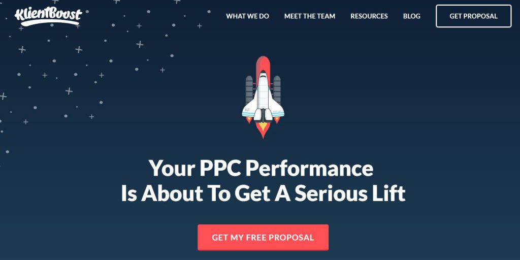
KlientBoost is completely devoted to amazing website design. Their site oozes beautiful visuals.
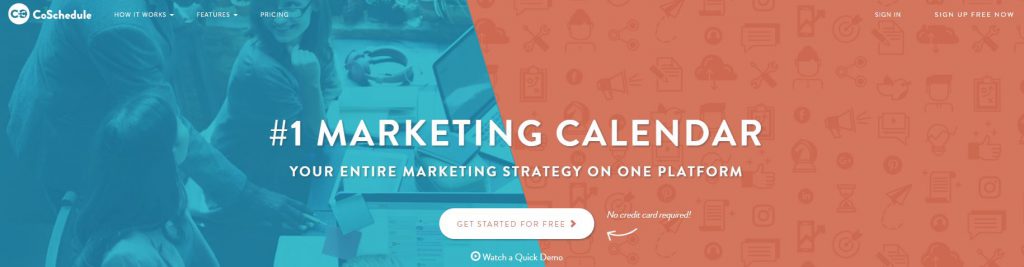
CoSchedule is a site I look up to as well. Their whole site is based on great formatting and consistent branding.
Expedia: Visit Britain received a developer award for its design.

You can also see more examples that actually won awards for great design at Awwwards and Webby Awards.
(Note: I also give a list of website templates with great visuals in the next section on responsive design, in case you’re like me and can’t code.)
Enough about visuals. Let’s get a little geekier.
Technical web design includes things like:
If any of these things made you say “What?”, don’t worry. I’ll explain them all in laymen’s terms.
According to Smashing Magazine’s post Responsive Web Design: What It Is And How To Use It:
“Responsive Web design is the approach that suggests that design and development should respond to the user’s behavior and environment based on screen size, platform and orientation.”
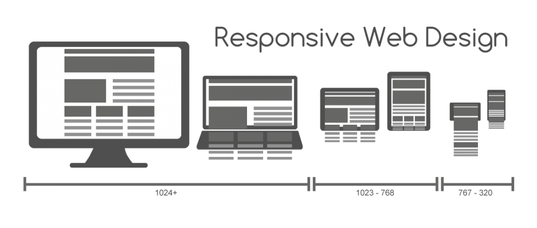
In other words, a responsive site is one that plays well on all screens and devices. It’s mobile-friendly and caters to the device you’re viewing it on.
If you think that sounds complicated… it is.
But it’s important. In fact, smartphones now account for over 51% of all online traffic, and tablets came in at just over 12%. And that number is growing.
Also, Google cares a lot about mobile-friendliness. In fact, they now place a priority on ranking mobile-friendly sites (an update called “Mobilegeddon“).
Finally, mobile-friendly makes for a better user experience. And ultimately, it’s all about the user. They’re the ones opening their wallets to keep your business afloat.
So what’s a non-designer to do?
First, see if your site is considered mobile-friendly by Google with their mobile-friendly test. It’s also a good idea to check it yourself by going to your site on your phone. If it doesn’t score well or look good, you have some work to do.
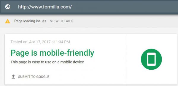
Yay, we’re mobile-friendly!
Besides hiring a designer, your best bet is to change your site’s template. This is the easiest and most affordable way to make your site mobile-friendly and responsive.
Here are some mobile-friendly templates for popular site builders:
According to surveys done by Akamai and Gomez.com, nearly half of web users expect a site to load in 2 seconds or less, and they tend to abandon a site that isn’t loaded in 3 seconds!
That doesn’t give you much wiggle room. But if you’re still not convinced, get this:
Roughly 79% of online shoppers who have trouble with website performance say they won’t return to the site to buy again, and around 44% of them would tell a friend if they had a poor experience shopping online.
In other words, if your site speed sucks, you lose. Big Time.
So how do you ensure a fast load speed? Try this:
Like the mobile-friendly test, Google also has a page speed test. However, some believe it’s not very accurate, so it can’t hurt to also try Pingdom and GT Metrix.
All three will give you an idea of what’s hurting your load speeds, with suggestions to improve.
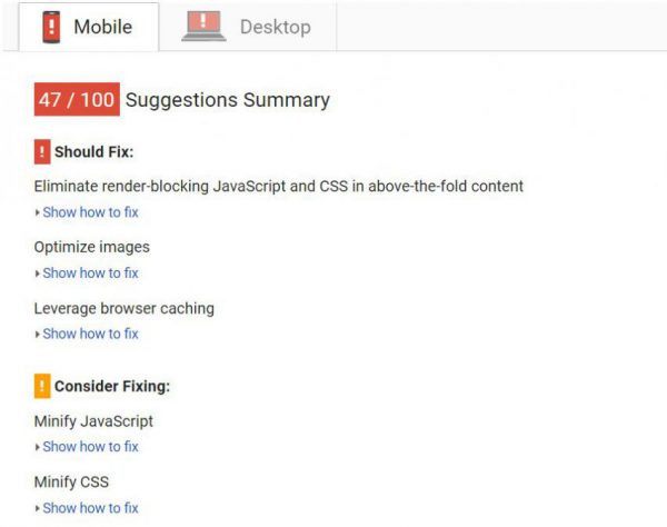
As you can see, there are a lot of ways to improve your site load speed, like browser caching and making above-the-fold content load first (the content you see without scrolling down the page).
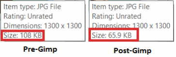
However, one of the easiest ways is optimizing and compressing your images. As I said in the visual section, images take up a lot of bandwidth. Which is why it’s important to only use images that are highly valuable.
You can use a tool like Gimp to compress your images for free. (Here is a tutorial to do just that.)
SEO means optimizing your site to show up in search engines like Google. It’s the bread and butter of what makes a good website.
Done right, it can drive thousands in traffic to your site every month without any extra effort.
Done poorly, not a soul will find you on Google.
According to Jon Rognerud, there are four steps to SEO. Here are some of Jon’s actionable takeaways:
This is highly simplified and there are a lot of other SEO factors, but these three tactics will get you well on your way to showing up in search results.
This next piece of web design advice helps with both SEO and building trust with your visitors.
You’ve probably seen the little green lock in your address bar next to a website.
This is called SSL encryption.
Google gives encrypted sites a small SEO boost. But perhaps more important than that is the trust factor it gives your visitors.
This is especially true if you sell anything on your website. People want to know their information is safe before they open their wallet.
Migrating to SSL is a delicate process. Here’s a guide to migrate your site to SSL without hurting your search rankings.
Remember design principle #4: Have a clear site navigation.
Navigation is important for two main reasons:
Remember to use the “three click rule”: Every page on your site should be within three clicks of any other page on your site.
To help you with this, consider mapping out your website. You can do it with a tool like Slickplan or just use pen and paper. They look like this:

Creating a physical map helps you see where you’re missing out on linking pages together, and keeps things organized.
You should also keep your most important calls-to-action at the top of the page. This is where the most people see, so it’s a great place for a “shop now” button, a “contact us” tab, or a “learn more” button.
Website tools are mentioned last because they can’t fix a broken website, but they can enhance an already good website.
Here are a few of our favorite tools:
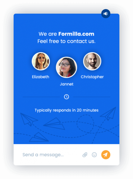
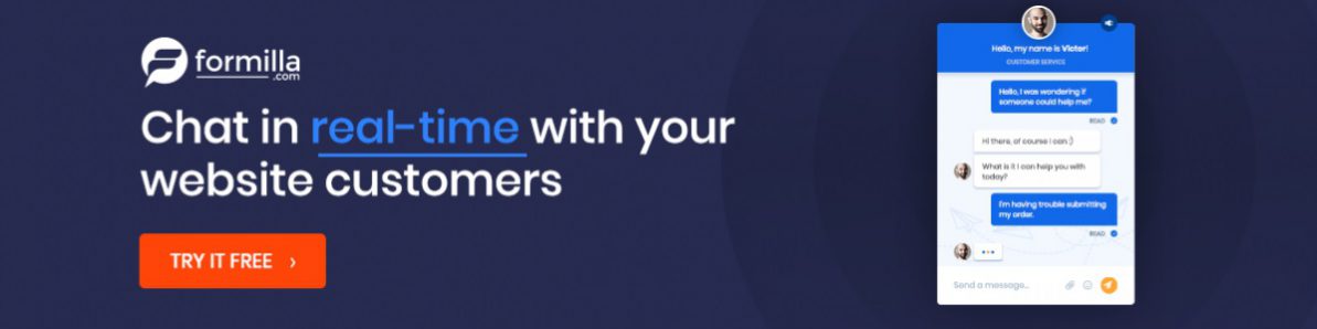
Live chat is an essential part of a business website. Or at least, we like to think it is. We do offer it as a service, after all. ?
But in all seriousness, live chat can help you provide excellent customer service, close customers who are on the edge and learn more about your target market.
In fact, in this post, we detail how to use live chat to survey your customers so you can improve your marketing. You can also receive notifications when visitors arrive on your site even before a chat conversation!

If we wrote “What makes a good eCommerce website”, Conversio would top our list. It automatically sends emails like the one above to try to recover abandoned carts.
(Side Note: The advice in this article does apply to eCommerce sites as well. So if you have an online shop, rest assured you’re not wasting your time by reading this.)
Anyway, with 69% of people abandoning their carts on average, you’ll be taking full advantage of this tool.
They also offer services like newsletter sending, product recommendations, and a stronger site search bar.
Have you ever seen an in line opt-in form like the one below, and wondered how to get one on your site?
Well, we use MailChimp and a premium MailChimp WordPress plugin to do it.
Here’s a 60-second explainer video:
See the sharing buttons to the left of the screen? They’re from a plugin called AddThis.
AddThis also has a few other features like a follow button and a related posts widget.
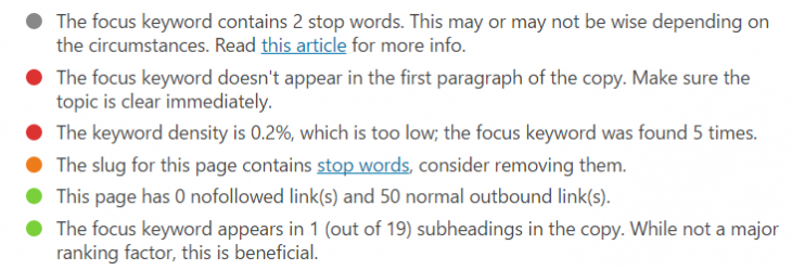
We talked about how SEO is important for a modern website. Yoast SEO makes on-page SEO super easy.
It gives you a checklist to show you what you need to add/edit to optimize your page for the keyword you choose:
 W3 Total Cache
Load speed is critical for SEO and usability. One of the ways to increase site load speed is with browser caching. W3 Total Cache makes caching super easy.
Here’s a guide to help you set it up.
What’s free, easy to install, and highly beneficial? Google analytics.
Google analytics can give you SO much insight on where your traffic is coming from, going, and stopping. And since it’s free, there’s no excuse not to use it.
Here’s a guide to installing and using Google analytics.
We’ve come to the end of our journey. Give yourself a pat on the back.
So what did we learn?
Basically, your website is your business card. It’s the thing everyone – your customers, shareholders, friends, family, and cat – sees when they think of doing business with you.
By keeping your website looking sharp, you ensure everyone who visits it views you as trustworthy, professional, and worthy of doing business with.
Plus, a strong website pulls in traffic through Google, gets links from authoritative sites, and is shared more often.
Nowadays, a great website is no longer a “nice to have”. It’s an absolute must.
Did you redesign or launch your site after reading this guide? Please share it with us in the comments below! And, as always, feel free to ask questions.
Comments are closed.

Nice one Bill. In the list of Website Tools (AKA “Useful Stuff to Make Your Website Better”), I would add a Browser Push Notification tool like PushEngage (full disclosure: am the founder), as web push performs better than email and is becoming more common choice. It works on both Mobile and Desktop browser, and is great to get users back to your site, when they are not browsing your site.
Thanks, Ravi! Glad you enjoyed it.
That’s an interesting claim. Do you have any data to back it up? I’ve been curious about push notifications myself. I’d love to see some stats on it, since email is currently the #1 choice of many industry leaders. 🙂
Sure. We published a set of aggregate results earlier which show that the Click Rates [ Click/Send] for Push can be as high as 10x over email. This stems from the fact that the Open rates [or views] for Browser Push are much higher.
Below image has the summary set of data. https://uploads.disquscdn.com/images/1c1cba2206ac9a2016fdc379a4c679e5c6ad73ae517bb51c5f878a0281bb124a.png
Wow, that’s awesome!! I’ll definitely put you in the post. I might even get PushEngage for my site! 😉
Your website is sometimes the only thing your customers see.
Bill, great post by you always. I enjoy reading the content that you have and I wish I had gotten you as a writer for my websites as well!
Ah, you flatter me! Thanks, Matthew! Glad you found it helpful! 🙂
Bill, I really like how you never miss the chance to mention the importance of a keyword research and implementation for a successful online presence! This is a great in-depth guide.
Hey Bill,
need to get in touch with you about the link to migrating to SSL which you posted to my site – oh and thanks for doing that by the way, we put a lot of effort into that, so we appreciate the love 🙂
David
Hey Bill, great article! Love what you’ve written about images having a purpose. Design and visual content are so much more than mere feel-good factors. And, with the overload of information we experience, anything that is not purposeful becomes an irritant.
Great Article!
Thanks for sharing this amazing blog.
I leaned a lot from this.
Keep sharing…
I loved the Way of your explanation. Quite simple and easily understandable. All website designing company should opt all this tips while making website design.